Contemporary Animation Technique and Aesthetics
Posted by <Ferg> on 2022-02-15
Editors note: This is based on a a talk given within the Do Not Research discord. It is part of a series of skill-sharing workshops within the community.
Has craft superseded concept in animation? Why is a medium with seemingly endless possibilities reduced to a genre in the popular imagination? And is it possible to unlock the potential of this powerful and unique artform? As a means of examining these questions, we can explore the history of modern animation techniques, how they are being employed today and what they reveal about the medium and its future.
Animation in the West is at an interesting inflection point right now. Since the 1990s, digital techniques have grown in importance and by the 2010s were completely dominant outside of experimental short films. The inflection point we’ve reached is the completion of this process, and the result is a re-evaluation of the aesthetics digital techniques brought with them. In particular, the rise of CGI (3D animation instead of traditional hand drawn 2D) brought along with it a bias towards representational realism. We can trace this development through the films of Pixar, who created the first 3D animated feature, Toy Story. The Pixar aesthetic can be seen as a merger between the classic cartoon design sensibility of Disney characters, and the representational realism that 3D animation’s early development brought along with it.
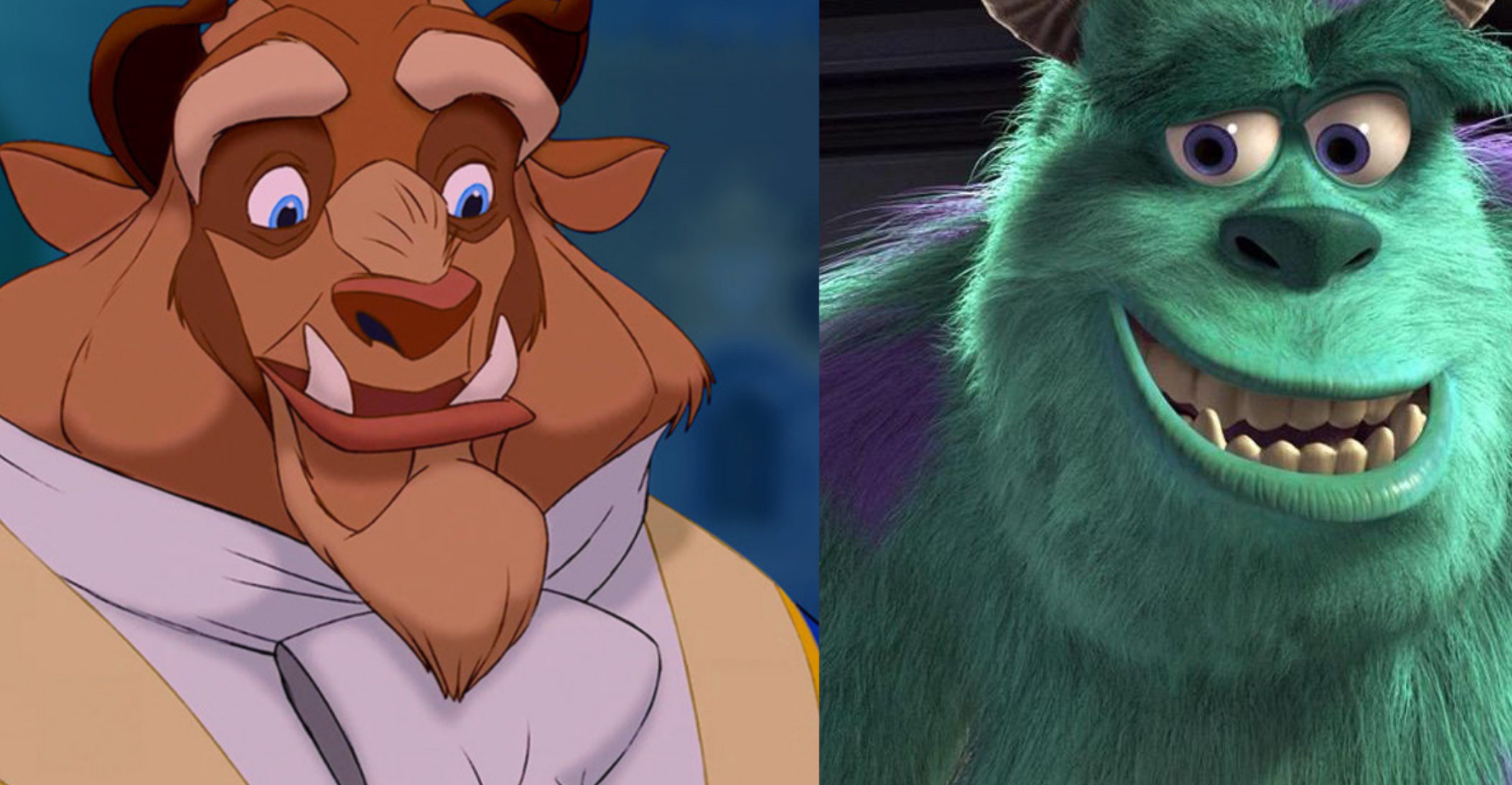
So while the characters were still cartoons, people marveled at the “realistic” plastic rendering of the toys. Indeed, the subject matter of the film was partly chosen due to the capability of 1990s CGI to more accurately simulate hard surfaces like plastic and varnished wood. While Pixar was in the business of storytelling, it was also a technology company. Co-founder Ed Catmull was an early computer graphics pioneer, owner Steve Jobs a technology entrepreneur. As such, Pixar’s in-house RnD pushed the medium forwards, and in doing so further instantiated their values into the process. Pixar continued to make feature films, and media coverage noted their technological achievements (accurate reflections, light and shadow, hair and cloth simulation, etc). A parallel, and even more realism focused process was happening in the live action VFX world, where CGI began to be used to realistically represent things that were tricky to pull off with practical effects (the dinosaurs in Jurassic Park are a successful early example).
This trajectory resulted in a commercial and artistic paradigm where 3D/CGI was seen as new, modern and superior, in part because of its “realism””. 2D hand drawn was old, archaic and not commercially viable – there were some notable hand-drawn feature films that flopped in the painful crossover period between 2D and 3D dominance in Hollywood animated features, such as Atlantis: The Lost Empire, which tried to incorporate CGI into the background while maintaining hand drawn primacy.
However, by the 2010s, close to photorealistic representation in CGI had been achieved. The pace of innovation in the capabilities of the software slowed, and a new equilibrium was reached. In a situation somewhat analogous to the replacement of painting by photography, people began to question why realism was important, and wonder what could be achieved by pushing the medium of 3D in other, more experimental directions.

2D meanwhile had been undergoing its own digital transformation. Rejected in the feature film world as archaic, it still thrived in the TV environment in part due to the prohibitive cost of making 3D TV shows. It was digitized first in the form of Digital Ink and Paint (coloring frames digitally rather than painting acetate) and subsequently with digital puppets which could be animated in a manner similar to 3D. Most top animated TV shows use this technique, with the software of choice moving from Flash to Toonboom Harmony. The difference in visual quality between early and modern episodes of The Simpsons traces this journey. The situation in Japan was different and followed its own logic, as one would expect from a tradition with fundamentally different roots to its Western counterpart; as such it can be considered separately although it is worth noting its increasing influence as we move towards the present day.
Modern Techniques: Klaus
Our new inflection point can be usefully explored with reference to three recent animated feature films. Firstly, let’s take a look at Klaus, a hand-drawn animated feature from SPA studios financed by Netflix. Here we see a resurgence of the 2D hand drawn technique, although in a form fundamentally altered by the digital takeover of the medium. Instead of drawing on paper, the artists draw directly into the software via digital interfaces (Cintiqs and tablets). The backgrounds are likewise painted in Photoshop rather than physical media, and the only remnants of photography that remain are its digital simulation in Compositing software.
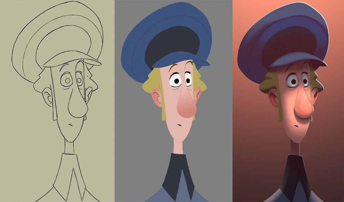
3D technology is used for plotting out complicated camera moves, particle simulations like snow, and rigid body props. However, the driving aesthetic guidance is in direct opposition to their digital nature. 3D props are painstakingly painted to reveal the hand of an artist, and simulate the effect of a 2D illustration. Particles are sampled from 2D textured images, and 3D camera moves have 2D characters and background elements superimposed on top of them.
Most innovatively in Klaus’s case, characters are lit by what can roughly be described as a 2.5 D process. This involves software making educated guesses about how the subjects in a scene should react to the lighting. Although fundamentally a 2D process, it aims to capture the immersive way in which 3D characters are lit and cast shadows in their environments, one of the things CGI is best at capturing. For this reason Klaus can be said to be a 2D film that tries to look 3D – their proprietary KlasS system is used to situate the characters into their environment in a way audiences have become familiar with in 3D features. However what’s notable here is that this attempt at harnessing 3D techniques is not an effort at realism, but rather a subordinating of digital processes to the aesthetic of a hand-drawn illustration.
Into the Spiderverse
Another instance of this can be seen in Sony’s Spiderman: Into the Spiderverse. While ostensibly a 3D animated feature film in the tradition of Pixar, Spiderverse is groundbreaking in its approach to 3D technique. Much like Klaus it is fundamentally an effort to base its final look on a 2D illustration, in this case the aesthetic of a printed comic book. The makers of the film went to extraordinary efforts to achieve this, and in doing so completely rejected the dogmas of realism which have accompanied the 3D process. Instead, they adapted this process in ways which had not been attempted before outside of the context of experimental short films (a consistent source of innovation in the animation world). 2D techniques, machine learning, and comic book style illustration were all thrown into the traditional 3D pipeline, resulting in something new, thereby progressing the medium.
This was a huge undertaking and could only be achieved with the financial backing of a large studio. A notable aspect of the film is the number of directors; although duos are more common in animated features, three people held the title of Director on Spiderverse, not including Phil Lord and Chris Miller, who were Producers that would have had final approval on every scene, and were deeply immersed in the day to day operations of the film. This breaking of the traditional directorial hierarchy happened by necessity since there was just so much work to do on the project that it couldn’t be allowed to bottleneck through one person, but it is notable that innovation on this level required the production to dispense with the ordinary hierarchy which came before it. As a film, Spiderverse is still relatively traditional Hollywood fare, but in terms of its technique it represents a definite break from the past and a reimagining of how the process of animated feature films can work.
I Lost my Body
So having examined a 2D film that wants to look 3D and a 3D film that wants to look 2D, what happens when a film simply dissolves these distinctions completely? Here we can turn to the French feature I Lost my Body which was produced independently and distributed on Netflix. I Lost My Body is remarkable as it represents a complete process merger of the 2D and 3D worlds. While we can say that Klaus is fundamentally a hand drawn feature (with some 3D characteristics) and Spiderverse is a 3D feature (with some 2D characteristics) no such clear distinction can be made with I Lost My Body. It is a film that was built level by level, using a “whatever works'' approach to achieving its desired end. It used the tools of both 2D and 3D without reference to the baggage that they carry, either the Disney design lineage of 2D or the “realistic” lighting and rendering of 3D. Rather, the strengths of these processes were harnessed in a way which was purposed towards creating a story which could not have existed without either of them supporting the other.
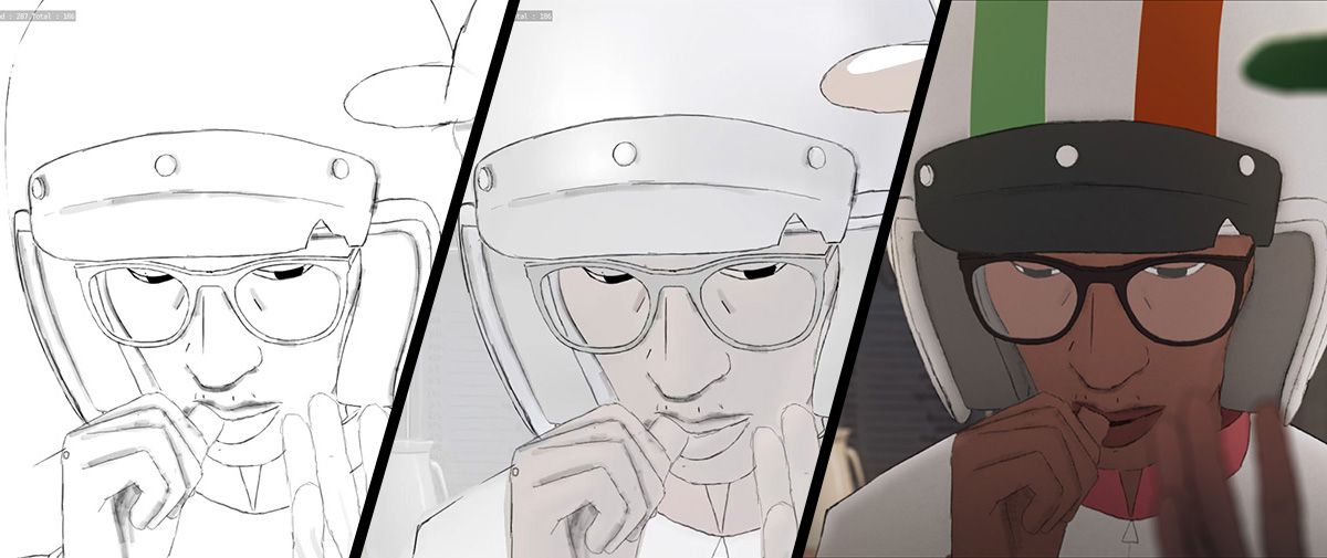
The film started its life as a traditional animatic (always the case with both 2D and 3D features in the West). It was then pre visualised in 3D, which allowed the filmmakers to take advantage of the camera capabilities of Blender (the open source 3D software they used) and not have to draw their blocking animation. Then the shots were drawn over (again in Blender) to give the characters their distinctly 2D hand drawn presence. Digital painting of the characters and background textures created a distinctly hand drawn environment which nevertheless had the freedom of the easily animated 3D camera. Using an approach like this meant that no particular shot needed to be made with exactly the same technique as the previous one; there are probably numerous shots in I Lost My Body that were assembled differently to the majority, but as long as the look remained consistent the best approach could be used. This separates it from a film that conceived of itself as a “2D” or “3D” film and therefore subconsciously brings along the baggage of those techniques and how they evolved.
The Human Hand
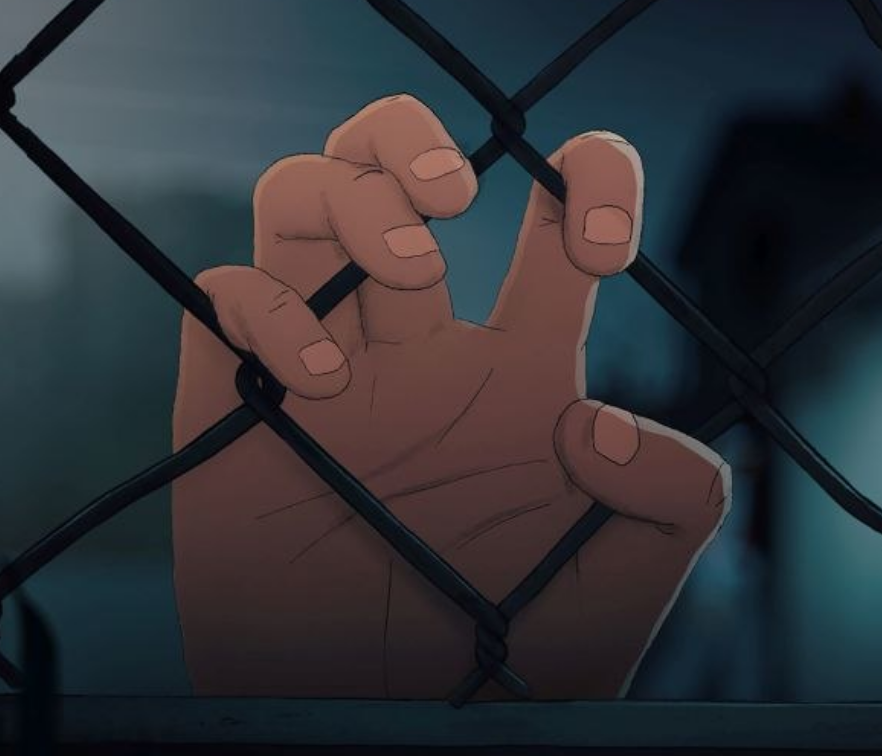
We can now step back and analyse this progress from a wider vantage point. Something we can see in each of the above films is an attempt to bring greater visibility to the hand of the artist. In their own way, they are all aiming to create films that look like illustrations which have come to life. Additionally, they can be seen as attempts to create something that looks new and original relative to what has come before it. But these are clearly baby steps, in a medium which can be frustratingly constrained by its own commercial and intellectual limitations.
Western animated films are still largely seen as a “children's genre”, artistically peripheral and fundamentally unserious. A simple explanation for this is the cost associated with making them – children's media is seen as a safer bet than something more “experimental”-- a word not prized in the lexicon of Hollywood’s financial backers. The lineage and values of the Walt Disney company also loom large over the medium, and we are only slowly beginning to escape its long shadow. But another fundamental part of this picture is the type of people who choose to involve themselves in this kind of work, and what they bring to the table. Who are the animators themselves? To examine this question we can look at the educational context in which these artists are produced.
Craftspeople VS Concept People
In the West, animation is still taught in a manner which originates in the Walt Disney Company. If we take Ireland (a European animation hub) as an example, formal animation training was introduced as a college course via the Don Bluth company, transposing the Disney model (Bluth was a classically trained Disney animator). This animation course, and its descendants, were created as third level art degrees; much like a Fine Art course, and exist in the institutions today in parallel to Fine Art BAs. Both target high school graduates with a talent for art, and therefore an important ideological split happens at this point. It can be conceived as those who value craft in their artistic practice over those who value concept. A Fine Art student is entering a world in which they will produce an Artist's Statement, the text which accompanies their work and reveals to the tastemakers, collectors and gallery owners that they are sufficiently serious in their practice. However, this is anathema to the prospective animation student- they want to exist in a context where their skill is judged according to the objective standards of the craft. The commercial origins of animation courses, which demand that multiple artists be able to produce material in the same style, allow for this sense of objectivity – there is a Correct way to draw a Disney Princess.
Having rejected the “confusing and pretentious” world of fine art, the animation student can now hone their craft, with reference to the great masters of their medium. They consider themselves Real Artists because their skill in drawing (it is assumed) can be assessed objectively. Armed with their superior artistic skills they are now ready to leave the institution and participate in the marketplace. In the more prestigious schools, such as CalArts and Les Gobelins, this means a pipeline into the commercial Hollywood animation world.
Generally speaking, the results are less than impressive. This is not because these graduates are lacking in skill; these institutions really do allow them to hone their craft. It is because at an early stage in their education they have renounced the value of critical analysis, the way of the contemporary Fine Artist. Without the tools to fundamentally critique the structures in which they operate, they are subordinated to the Hollywood algorithm.
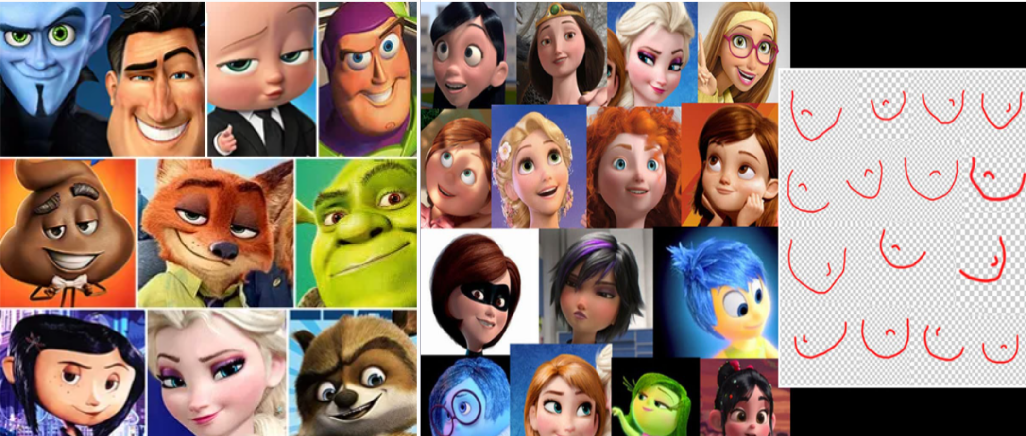
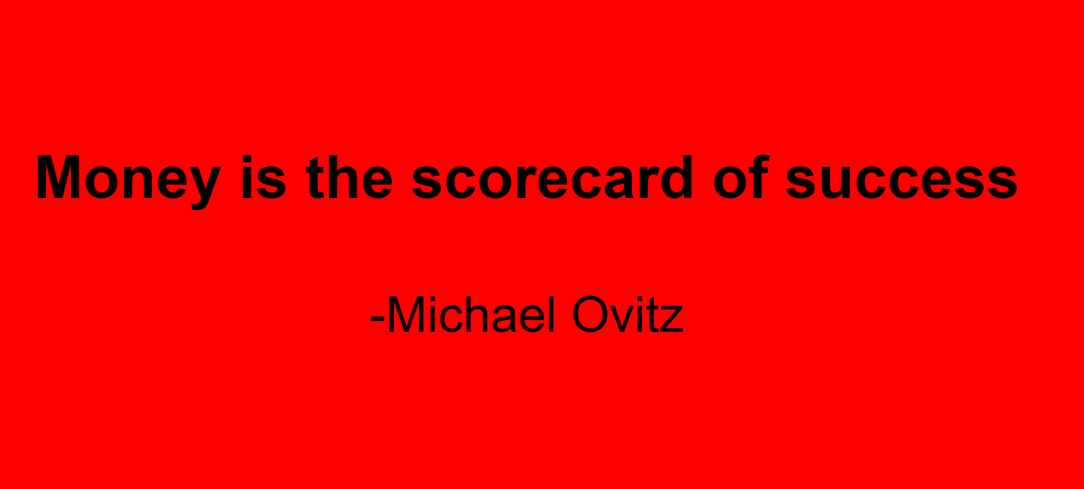
This process, like the recommendation algorithms of Netflix or Spotify, can only refer to past behavior as a standard for what the future should be, and we are therefore given Pixar face, Dreamworks face, and the CalArts style endless repetition of character designs, story structures and workflow processes. In the end, the objective standard by which they so desire to be judged is best summed up by the quote from Hollywood uber agent Michael Ovitz, that “money is the scorecard of success”.
This is not to say that the Fine Art world is faring any better. Although unlike animation it can claim to be taken seriously by a narrow class of sophisticates, it is largely disdained by the general public who will tell you that they don’t understand it, and in doing so make it clear that they don’t believe there is anything worth understanding there. Galleries have become museums. The Fine Art version of Dreamworks' face is publicly masturbating and calling it performance art– literal pretentious wankers. There is much that is boring and derivative, and its utility in money laundering is more destructive than anything in the commercial animation world. But it will always contain the seeds of its own renewal by holding onto the value of analysis and fundamental critique. Being able to articulate what your work is about and what your goals are is an indispensable part of the artistic process because ideas do matter more than the craft that realizes them. Analysis can lead to self consciousness of one's situation, and thereby suggest a path towards changing it.
We have seen how animation has reached an inflection point due to the progress of technology changing the way in which it is produced, and in doing so challenging some underlying assumptions of the process. Students who are studying animation, or simply have an interest in the medium, would be wise to engage with the next steps of this process, and make it their mission to explore the myriad possibilities of this powerful medium. In doing so, it is worth remembering that technique is subordinate to concept, and craft is only important insofar as it serves the ideas it represents. The divergence between the Fine Art student and the animation student occurs due to both commercial and institutional factors, but it can be overcome by any student who takes theorizing as seriously as craft, and vice versa. The more you do this, the more you will realize that you cannot have one without the other.
